How to Identify Product Photo Colors with Image Palette
Contents
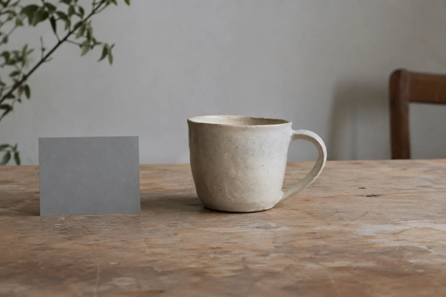
Use Image Palette as a starting point for describing what a product photograph shows. Choose a representative view, compare the returned swatches with visible parts of the image, and check the lighting before writing a color label. Treat photo-derived colors as approximate references: they can guide a description, but a manufacturer color code or physical finish claim needs product documentation.
A practical review keeps three contributions separate: the product, the lighting, and the background. Work through the steps below with the original photograph beside you. Your goal is a short description of the main visible color and any contrasting details, supported by a clear view of the item.
Choose a representative product photo
Start with a photograph that makes the item easy to inspect. A lifestyle scene may contain more color from the surroundings than from the product, so ask whether the item or its setting dominates your attention. Prefer a view in which the main body and relevant trim are clearly visible.
For a new photograph, try daylight without direct sun and choose a flat, evenly lit area of the product for comparison. Include a neutral white or gray object in the frame as a reference. Keep it visible while reviewing the photograph, and distinguish it from the product when considering the palette.
Before proceeding, answer three questions:
- Can I point to the main body color without relying on a highlight or deep shadow?
- Are the details I plan to describe visible?
- Is this view representative of the item, or mainly useful for showing it in context?
If the photograph cannot answer those questions, choose another view or take a clearer photograph before committing to listing wording.
Prepare the image and choose the color count
Select the local image you intend to review, and confirm the current tool’s accepted inputs before submitting it. If a color-count control is available, choose a value within the range shown by the tool. Use an initial result to decide whether the selection is useful; do not assume that requesting more colors guarantees a better product description.
Review any image conversion before extraction. If your conversion replaces transparent areas with white, that white becomes part of the image you are asking the palette workflow to summarize. Identify it as background when matching swatches to the photograph.
Keep the original available alongside the prepared version. Check that any crop still includes the main product area and the details you want to describe. JPEG compression can introduce small color variations, so avoid treating a slight difference between image versions as evidence of a different product shade.
A useful preparation note records which view you used, whether you cropped it, and whether the background changed. This makes later comparisons easier to interpret.
Understand what the palette summarizes
Read the palette as an approximate summary of photographed colors. It is a prompt for inspecting the image, rather than proof of the product’s official shade.
Before interpreting the first swatch, check how the current output explains its ordering. Do not assume that the first color identifies the product. If the output uses frequency ranking, compare the leading swatch with the large areas of background as well as the item. A photograph dominated by scenery may give those surroundings more importance than you want for a listing.
Check the tool’s explanation of color selection and any reduced sampling before drawing conclusions about completeness. If a small accent has no recognizable swatch, return to the photograph and inspect the detail directly. Record what you can see without forcing it into the nearest displayed color.
Keep two observations separate: this color appears in the palette and this color belongs to the product. Only the second observation belongs in a product description. An unexplained swatch is a reason to inspect the image, not a reason to add another color to the listing.
Match swatches to visible parts of the photo
Place the original photo next to the palette and work through the swatches individually. For each one, point to a visible area that could account for it. Leave a swatch unassigned if the match is unclear.
Use a simple worksheet to organize your observations:
| Possible source | What to inspect | Listing decision |
|---|---|---|
| Main product body | A broad, evenly lit area | Consider it for the main color |
| Trim or accent | The specific visible detail | Describe it separately if clear |
| Background | Surroundings and reference objects | Exclude it from the product color |
| Highlight or shadow | Another view of the same area | Check before assigning a color name |
A photograph records reflected light, so a bright or dark patch deserves another look before you describe it as a separate product color.
If surrounding areas dominate your review, try a tighter photograph or prepare a crop in an image editor before running the palette again. Retain enough of the item to understand which part you are inspecting. Compare the new result with the original view and reassess your assignments.
Check lighting before choosing a color label
Check the lighting before choosing between similar color labels. The photograph records light reflected from the surface, and phone-camera white balance and saturation processing can influence the recorded colors. Differences between images therefore deserve investigation before you conclude that the item has multiple shades.
Choose a flat, evenly lit product area for your comparison. If taking another photograph, use daylight without direct sun and include a neutral white or gray reference object. Inspect the reference as well as the product, while avoiding any assumption that including it automatically corrects the image.
For example, suppose one view suggests a warmer color name and another suggests a cooler one. Compare the same product area in both photographs. Look at the surrounding scene and lighting, then take a more consistent view if the disagreement would affect a buyer’s expectations.
Do not resolve uncertainty by choosing the most specific name that sounds plausible. Use a broader description when it is clearly supported, or postpone the color claim until you have a more representative photograph or reliable product documentation.
Compare photographs together
Bring several useful views together in a contact sheet, or place them side by side. Keep the corresponding palette with each view if practical. Use the comparison to ask whether your proposed color description fits the item across the photographs.
Compare the same parts: main body with main body, trim with trim. Note whether a disputed color appears in an evenly lit area or mainly in a particular highlight, shadow, or setting. If the photographs disagree, select a clearer view or take another photograph rather than averaging the swatches into an unsupported label.
When comparing two separate items, photograph them together under the same light. This is a useful way to judge their shades within one shared setup.
Finish with a brief working note. For a hypothetical item, it might read: Main body appears consistently dark blue; edge detail needs a clearer view. Write your own note from the photographs you actually have, separating settled observations from details that still need checking.
Turn observations into useful listing descriptions
Write the listing around the main visible color and any clearly supported contrasting detail. Choose a broad color name when the photographs support that description more confidently than a narrow shade name. Keep uncertainty about an accent from becoming a confident claim about the whole product.
For a hypothetical product with a clearly blue body and a clearly black edge, a useful description could be: Blue body with contrasting black edging. If the accent is unclear, resolve that detail before including it. Avoid importing a background swatch into the sentence just because it appears prominently in the palette.
Use extracted values as provisional working references. Before publishing a manufacturer color name or code, verify it against documentation for the exact product or variant. Check documentation separately for any physical finish claim; a photographed appearance alone should not carry that claim.
Before publishing, review the sentence against the image:
- Does the main color refer to the product body?
- Is every additional color tied to a visible detail?
- Have lighting and background influenced the wording?
- Is any precise color or finish claim supported by matching product documentation?
Keep the finished description concise. The detailed checking belongs in your workflow; the buyer needs a clear, supportable account of what the item looks like.